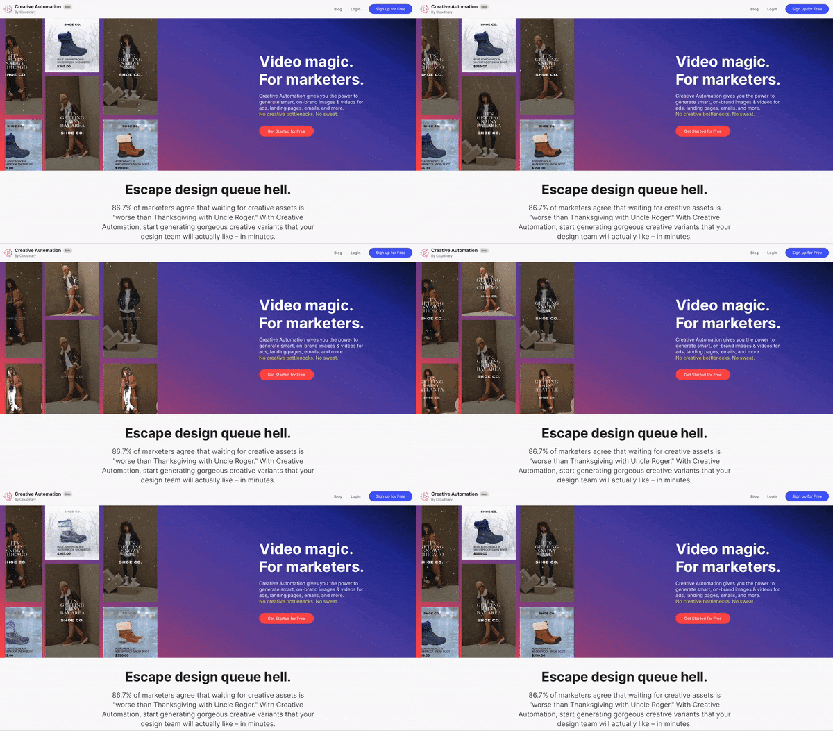
We recently undertook a coffee-fueled sprint with one of our clients to relaunch their website…in 24 hours.
Some background: the client’s product automatically creates pixel-perfect versions of a company’s images and videos for different channels (FB ads, emails, etc.). The company had previously targeted designers and creatives. Now they wanted to experiment with reaching B2C performance marketing managers.
So they needed a new website. And for various reasons, they needed it fast. Like… 24-hour fast.
As a rule, we don’t recommend a 24-hour website relaunch. But the experience was a reminder that your website plays a hugely outsized role in how you position your brand. And the language you use is the #1 determinant of your success.
So here are three tips for website copywriting that actually delivers results. (A caveat: this product is an example of product-led growth [PLG], where we’re targeting the end user with the goal of registration. But the takeaways are all equally applicable to a B2B enterprise sales process.)
Here’s how to write your website – right.
1. Be specific.
Marketing-land is awash with hand-wavy claims. Innovate fearlessly. Future-proof your business. Synergize your digital transformation(?).
Be specific. Specificity cuts through the noise… and sells. (See the title of this blog post – it would have been much less effective as “how to improve your homepage by a lot.”)
- Who are you for? Founders and early-stage startup leaders often want to hedge their bets. (“We’ve seen traction in financial services – but maybe our ICP includes travel and hospitality as well?”) But we’ve seen time and time again that being crystal-clear about who you’re for – even who you’re not for – turbo-charges results. In our case, our bullseye persona was marketers. So we said that. Like… literally. “For marketers.” And if it weren’t for space constraints, we could have probably gone even further – ”for marketers of e-commerce brands who feel like they spend too much time waiting on design assets.”

- What specifically are they going to do with it? We highlighted use cases – pitched at the right altitude for our target users. In some cases, especially with an enterprise sales process and an executive buyer, your use cases will be big, abstract noun words. (Personalization. Compliance. Cost reduction.) Here, they were examples of creative automation across different channels – which makes sense, given that our target persona (performance marketing managers) often specialize by channel.

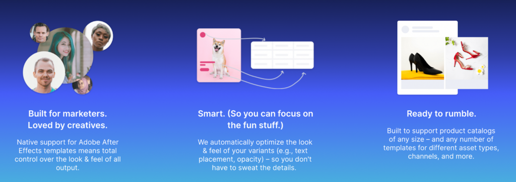
- What are the benefits? As a rule of thumb, we never make any marketing claim that we can’t quantify. It’s just noise. (Same reason that numbers help on a resume. We help you move faster. Okay – how much faster? 7%? 38%?) In this case, we had two legit stats. And one winky one. That’s okay. Again, specificity sells.

2. Be human.
Show personality. Your buyers and users are people, too. Of course it’s important to tailor your tone to your target audience: the way a cybersecurity company would talk to Chief Information Security Officers (CISOs) is different from the way a B2D tech platform would talk to software developers. But the idea is the same. Your target audience is looking for cues – in your language, your references, even your look and feel – that you understand them.
In this case, we let our hair down a little bit. We dropped a slightly naughty word (h-e-double-hockey-stick!), made a joke about dreaded Thanksgiving dinners with relatives, and included cat memes in the previously-referenced “by the numbers section.” All of this is spot-on for marketers.

3. Make your uniqueness obvious.
You probably spent time building a positioning strategy for your company and product – which included some insight into how you solve your problem in a unique way. (Here’s a resource to jumpstart your competitive analysis if you haven’t done so yet.)
But often the differentiation gets buried on the homepage. Which is a shame. Because at the end of the day, arguably the most important question a visitor would have is how you stand out from the crowd.
Want to make it easy for your buyers? Remind them why you’re different. Ideally in a way that’s simple and memorable.

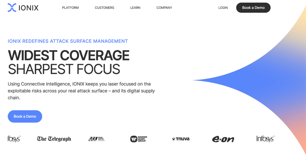
Here’s another great example from a Blue Seedling client. Notice that they elevate their uniqueness to the level of their tagline – to highlight how they are different within the attack surface management category.

The final word
Your website is your most important piece of positioning real estate. Follow these tips to tell your story in a way that’s compelling – and resonates with your target audience, driving urgency and action.
Finally, a shameless plug. Reading this post and thinking “Gee, I wish my company had our positioning more buttoned-up”? Check out Blue Seedling’s new positioning offering. It’s the fastest way to get world-class, category-owning positioning – 86.7% faster. 😉


