I was recently speaking with a VP of Marketing who was evaluating different B2B brand positioning agencies, when she said:
“I don’t want a beautiful website that’s not converting: The story isn’t more important than the performance. I don’t want to end up with a useless website that tells a story, but does nothing but tell a story.”
Simple. Direct. Spot-on.
A website is oftentimes the entry point for a customer in the B2B buying journey. Because it’s highly visible, founders and marketing leaders put a lot of effort into making it look impressive and tell a powerful story. (And we have lots of experience taking websites from good to great – ridiculously fast.)
But it’s important to keep in mind: Your brand and website are a means to an end. They’re tools to drive your company forward, helping you hit your growth, revenue, and pipeline goals.
At Blue Seedling, we approach brand infrastructure accordingly, and we’ve compiled the following tips to aid you in creating a brand and a website that do more than just dazzle prospects with slick design.
Our roots are in demand generation and marketing operations. So even when we approach a pure brand positioning engagement (which often includes (re)designing a website or homepage), we look at it from a business standpoint first. How can your website funnel your prospects deeper into the buyer journey?
We’ve written before how a great website is a “powerful conduit for your startup’s value proposition.” When crafting your homepage, it’s important to think of it as an ambassador of your positioning statement. Good positioning statements answer the who, what, and why of your product – who stands to benefit most from it, what it offers, to what brand category it belongs, and why it’s different from all other alternatives. Hooking prospects with clear answers to these key questions will drive them to click deeper into your site, read your collateral, book demos, etc…
Regardless of how you lay out your homepage or how many snazzy graphics you include, make sure the following 3 elements are front-and-center:
- Your Main Message (cuts to the heart of what you do and who you are. Bonus points if your prospects can immediately identify the what and the why from your main message)

2. Your Secondary Message (expand by defining what you offer and to what category you belong. Bonus points if you can identify who stands to benefit the most from your product in this message)

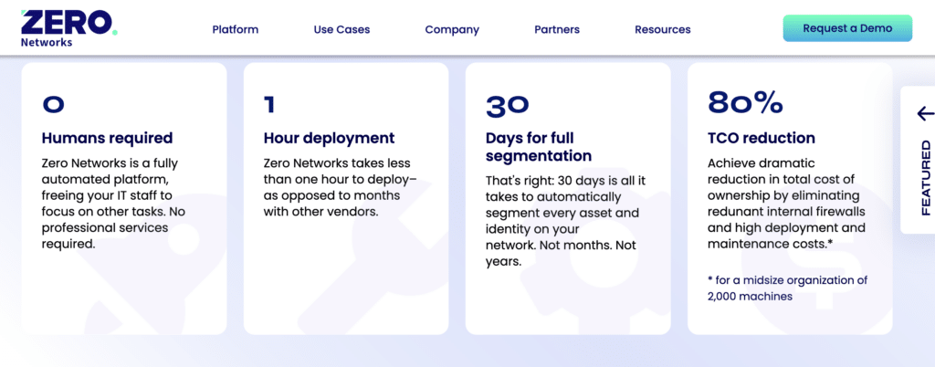
3. 1 – 3 Benefits / Differentiators (really dig into the “why.” Supplement with hard data, customer testimonials (“social proof”))

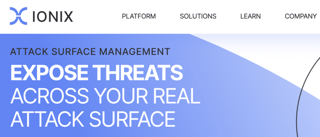
For some examples of this formula in action, check out Blue Seedling clients Zero Networks, Dig Security and IONIX.
If you can, make this exercise quantitative, not qualitative. For example, our positioning engagement for an Israeli unicorn included a rigorous homepage messaging A/B test, which showed a statistically significant improvement in web conversions – an increase by over 50% – with our recommended messaging.
Even when you don’t have the luxury of A/B testing (like many early-stage startups), it’s imperative to road test your new brand narrative, positioning, and messaging with your circle — investors, customers, and prospects. That way, you know your brand and website upgrade are not only telling a good story, but also giving you quantifiable results. (Just be careful you don’t get trapped in the vicious cycle of “marketing by committee.”)
The bottom line
Don’t settle for just a pretty website. Go for a brand, messaging, and website that work together to both tell your story beautifully… and generate those sweet leads. That’s what we call beauty and brains.
Further reading
- Suitcase or zipper? How to make sure you’re fixing the right problem with your enterprise B2B positioning
- The Enterprise B2B Category Tap Dance: When You’ve Picked the Wrong Market
- Looking for social proof? 3 ways to add credibility to your website immediately
- Quick hacks for finding out your product differentiation


